Pages

Monday, August 1, 2011

Tackling the UFOs-Caryl Fallert Small Blocks

Earlier this summer I vowed to tackle the many unfinished quilts/projects sitting in my sewing room, and promised not to start any more big projects until these were done.  So far, I'm making progress.  Number 5, the Visions of God quilt, is finished.  I've been working hard on number 2, the Hawaiian applique (more on that soon I hope), and over the past weekend I finished number 7, the small blocks from Caryl Fallert's class.

I talked a little bit about her class before, it was really a fabulous workshop all around.  The blocks I pieced as part of the design exercises in the early part of her class.  The blocks are all potholder or place mat size, and just this weekend I finished adding borders and quilting/finishing them.

The first one was string pieced, and the purpose of the exercise was to put together a contrast gradient (light/dark) using a single colorway.  We had a giant table of solid strips contributed by everyone in the class, and used those as the source to put together our gradients.  One of the great tips Caryl gave us was to use the black and white setting on your camera to look at your gradient.  Often it's hard to tell which fabric is darker when color is in the way, so using the black and white view removes that factor.  I'm really a fan of having contrast variations, the lights and the darks really make a design pop in a way that all medium tones can't achieve.  I'm not always good at that though,  many of my quilts have lots of bright colors in medium tones without much light and dark.  Another thing to work on!

Anyway, here's the basic string pieced yellow-brown gradient block I made.  You can easily see the contrast changes in the black and white photo.  I added the pink-orange border after the fact and quilted practice feathers on it.  My grandma really liked this one, so I gave it to her.


The next block we made was not a contrast gradient, but was just an exercise in appli-piecing.  This is Caryl's method for combination curved piecing/applique that avoids the stress of regular curved piecing.  The edges are turned under (around a template) and then a very small zigzag stitch is made over the edge using invisible monofilament thread.  This one was potholder size and then I added the purple border and tried to practice some quilting designs.


The contrasting quilting emphasizes how much I still need to work on being smooth when doing free motion work!  I'm probably going to donate this one to the Dallas Quilt Guild mini-quilt auction at their quilt show next year.  It was good practice and I love the colors (especially that print in the bottom section), but you only need so many little quilted blocks hanging around the house.

This last one was an exercise in combining at least two gradients and the appli-piecing technique.  I got a little too complicated and decided to try intersecting gradients in two different colors (green and pink) as well as plain gradients in those colors and a brown gradient.  It looks a little chaotic but kind of reminds me of strawberry fields.  Instead of putting on a regular binding, I thought I would try doing a faced binding in case I ever want to try that technique on a big quilt.  It worked out fine, but the corners are a little more rounded off than I would have liked.  This one is 8.5 x 11, and since it is small enough I might donate it do the Alzheimer's Art Quilt Initiative.  They sell small donated quilts to raise money for Alzheimer's research.  They also have a collection of gorgeous large art quilts that they periodically auction off as well.


These were all fun to make and I was glad to have some good opportunities to practice my machine quilting since I have a couple nice tops waiting to be quilted.

Friday, July 29, 2011

One Hen, Two Ducks- the Extras

Just a quickie post today to show you the purpose to which I put the leftover hexagons from the One, Hen, Two Ducks extravaganza.

The leftover hexagons make great potholders! Stitch two together, with a layer of heat-resistant batting, add a hanger, and voila,  instant potholder. Since I used different hexagons on each side, they're fun on the back and the front.  I made a bunch of these and gave them as stocking stuffers to my family.  Here's a picture of the one I kept.  It was the first one, so I had no real idea what I was doing and forgot to add a hanger.  It's now been well-used and is quite stained.

Front

Back

Here's the one I gave my mom.  When I first called to ask her to take some pictures to send me, she got a little hysterical because she couldn't remember having seen it since I gave it to her for Christmas- she knew it wasn't in the potholder drawer and thought she might have thrown it away.  Luckily, she had hung it on the wall next to the coffee pot to add a little color to the kitchen, and had just gotten so used to seeing it she forgot it was there.

Back

Front

This is a great thing to to with any leftover blocks that don't make it into the final quilt, and they make great gifts.  The only thing I'd recommend is using two layers of the special heat resistant batting; I only used one and it's a little thin when you're holding onto something hot for an extended period.

Wednesday, July 27, 2011

Sounds of Light-Part 2

After piecing the background, I added a fun dark purple border.  You can see it in this picture; it's actually quite a bit darker than the picture shows; really a rich deep dark purple that reads almost as a solid but with shadows and light spots.  Again, one of my favorite fabrics ever.  Then I embroidered a snippet from the first verse of Psalm 100 (the rest is on the label).


For the quilting I just did large loose feathers in the background and quilted around some of the shapes in the organ.

I love the colors in the final quilt and I loved the process of designing and piecing the organ, and choosing the colors to give it some dimensionality.  I feel like I captured the feel of Linda playing and her fabulous music soaring out into the world.  One thing that has always bugged me a little bit is that I feel like the organ looks crooked.  After measuring repeatedly, I've concluded it is straight, but the angled rays really make it look off kilter.  Something to remember as a design element.  By the way, the quilt is not actually skinnier at the bottom than the top, I just had a bad camera angle.

A Beautiful Scale, 2008, 33"x 45"

 As a final touch after completing the whole thing, I stitched on a few musical notes using ribbon and beads, and made a label for the back.


Funny related story; when I first assembled this quilt top, I wasn't sure the scale of the individual elements was quite right.  I asked my sister and mother several times whether it was ok (I'm still not sure) and they kept reassuring me that it was fine.  Finally I asked my quiet, reserved, sweet-but-uninterested, and not-at-all crafty brother-in-law what he thought.  My sister told him, "tell her the scale is fine."  He did tell me that, and ever since then whenever I've shown him one of my quilts his first comment is always (regardless of the project) "It has nice scale."  And then we laugh.

Monday, July 25, 2011

Sounds of Light-Part 1

In 2008 my dear friend Dr. Linda Kelly celebrated her 20th anniversary as organist and choirmaster at our church.  The parish had a big celebration and I decided to design and make a quilt for her for the occasion.  I knew I wanted to incorporate both her and the fabulous Bedient organ which is in our choir loft.  I started by taking several pictures of the organ; these are the best I could get due to the architecture of the church , but you can get an idea of the scale of the instrument and the way it was designed to perfectly fit the space.


After taking the pictures I made a line drawing (not my strong suit) of the organ and turned it into a foundation piecing pattern.  It took quite a while for me to get it drafted and even remotely proportional, but I succeeded.  After finalizing my initial drawing, I had it enlarged and printed out, then traced it onto freezer paper.  Here are my finalized initial drawing and the enlarged (full size) pattern.

Initial 8.5x11 drawing


Full size drawing

I decided to place the organ on a background of a radiating sunrise illuminating the darkness of night.  I designed the background in EQ6, and printed/enlarged it the same way.

block for background, designed in EQ6

After enlarging and tracing onto freezer paper, I numbered the piecing order etc.  There are a few smaller pieced parts that aren't labeled on the large pattern; for example I added in lines to piece the organist hair,  some of the organ pipes, and the chevrons in the sun rays.  I paper (foundation) pieced the whole background, then pieced the organ the same way, then appliqued the organ onto the background.

Here's how the organ part looked after piecing:


The organ pipes in the two sections flanking the middle are pieced (with black pieces at the bottom) to emphasize the pipe shape, while I used that fabulous grey print (it's one of my favorite fabrics) with the swirly stripes for the other pipe pieces.

Stay tuned: on Wednesday, the whole quilt!

Friday, July 22, 2011

The Pouch Challenge-Round 1

Once again, I'm very late to the pouch party.  The pouch fabulousness on Flickr is just amazing, so inspired by things like this jaw-dropping coolness, I decided to make a pouch.  I like the little tuck things on the green pouch, they remind me of the superb illusion quilts by Caryl Bryer Fallert like this and this and this.

I didn't really have instructions for making a pouch or doing tucks, but I knew I wanted my tucks to nose up against one another.   I wanted one side of the tuck to be brightly colored (I know, surprising) and the other side to be the muslin that I'm using for the background.  So I cut a few strips of color 1.25 inches wide (finish at 3/4), and a few strips of muslin at 2 inches wide (finish at 1.5) reasoning that the muslin should be twice as wide as the color so that there would be enough to serve as the back side of the tuck and the background.

If that made no sense, don't worry, that is the right math if you want your tucks to touch noses with each other.  So I assembled my two pouch-sides-with tucks and tacked them down.  Here's one side:


Sadly, as you can see, when pulled over, 3/4 inch tucks are too big for the height of my fabric.  Everything just pulled up really bad.  I realized I should have made skinnier tucks or made the pouch taller.  In order to salvage these blocks, I went ahead and ripped out the stitches holding the tucks down in the middle and just flipped them over at the top.  Here are pictures of both sides.


After all that though, I decided the tucks were too big and the panels too big for the pouch I had envisioned.  So I set them aside to be used for something else, and started fresh.  For the second try, I decided that I would have 1/4 inch finished tucks which would mean cutting my colored strips at 3/4 inches.  I noticed that the finished size of my first colored strips was the same as my cut size for my second strips, so I thought I'd just use the finished sizes from the first time to cut all my second strips.  Alas!  That was not the right math!  3/4" cut colored strips did give 1/4" finished strips but 1 1/2" cut strips (the finished size from above) gave 1" finished strips! In order for my tucks to have touching noses (as in the second picture above), the muslin strips should finish at twice the finished width of the colored strips, in this case 1/2 inch.  Therefore, my muslin strips should have been cut at 1" instead of 1 1/2".  I was so aggravated, I had very nice tucks but they didn't touch noses!  To compensate I had to slice my pieced pouch-sides (both, because of course I sewed all the tucks before I noticed) between each tuck and sew the pieces back together, effectively removing the extra half inch.  This made all my tucks touch noses, but also made for tons of bulk behind the tucks.  It was also hard to sew the pieces back together with all the tucks in the way so some of them didn't turn out quite right.

I then added some iron-on interfacing to the back and did some free-motion stitching.  The pieces were kind of hard to hold onto since they are pretty small, and the interfacing didn't glide very smoothly and made un-ironable wrinkles.  Incidentally, as a result of this project and the Visions of God quilt, I'm feeling pretty done with interfacing.  After adding a strip of color which would later become the pouch bottom and choosing a lining fabric, I was ready to assemble the pouch.

Back Side

Front Side


Fun Frog Lining!

Actually assembling the pouch was fairly straightforward, when I got a little confused I just referred to the assembly instructions in this easy-to-follow tutorial from Make it Perfect.  I did learn that if you wish to topstitch around the zipper edges (to minimize lining getting caught in the zipper), it's better to to it immediately after attaching the lining/sides to the zipper rather than after the whole thing is assembled.  Also, it was tough attaching the zipper to the area where the giant bulk of tucks was.

I think the final pouch turned out ok for a first attempt, but would definitely classify this as "needs improvement."  Better ones are in the works!


Wednesday, July 20, 2011

Visions of God-The Quilt

I'm so excited to have finished this project!  I get to cross if off my UFO list which is soooo satisfying, and I think it really turned out well.  I laid out all the blocks, some of which were shown here, on my design wall (a really optimistic description as anyone who has ever seen my quilting room knows) and tried to arrange them in a pleasing fashion.  Instead of putting sashing between each block, I decided to group them so that the sashing made a cross shape.  I think that gives some overall interest to the layout, and prevents the blocks from feeling too broken up.

The parish associate told me that the quilt was going to be used as an altar cloth for the casual evening service at our church.  I was worried that it might be too puffy with regular batting since I didn't intend to put much quilting on it, so I decided to put medium weight Pellon interfacing inside instead of batting.  In retrospect I definitely would recommend using flannel or something if you don't want to use batting because the interfacing was pretty stiff, not very drapy, and so flat that every little wrinkle and pucker showed up. Luckily, after I washed it the whole thing softened up a little bit.  I used spray baste to adhere the interfacing to the batting and the top to the interfacing and then quilted the top 1/4 inch in from the edges of the blocks and sashing.  The back is just solid green, another thing I won't repeat; the solid shows every little spot and when some fraycheck (awesome stuff btw) seeped through to the back of the quilt it left an ugly spot that wouldn't come out on the back even though you can't see it at all on the front.

I used a standard binding, but sewed it on starting from the back, then flipped it around and top-stitched it down on the front.

I hope the people at the church like it!

Visions of God, 2011, 63"x 63"

Monday, July 18, 2011

Visions of God-The Block Party

Finally, I'm going to talk about a current, happening-in-real-time project I've been working on for a while.  So much in-real-time that it's not even finished yet.  I hope to have it completed in the next couple of weeks, but who knows.  Sadly we're having a wretched heat wave here just now (in common with many places) and my sewing room is too hot to spend much time in.

Last summer some people at our church decided that we should have some activities before services since Sunday school takes a break for a few months.  One of the suggestions was that one week we set up a make-your-own-quilt block area and ask parishioners to make a quilt block depicting their vision of God.  I cut up a whole bunch of eleven inch blocks and gathered up a bunch of coordinating fabric, scraps, and fusible and took it down to the church.  

Anyone who wanted to participate just drew, cut, fused whatever they felt inspired to make.  I was sadly absent on the initial day, but by all accounts a fun time was had by all.  We didn't get quite enough quilt blocks from that morning, so in the fall our parish associate subsequently approached one of the Sunday school classes and encouraged them to make some blocks and I gathered up blocks from a few more parishioners.  Still three blocks short, a few weeks ago I made the remaining blocks using imagery from people who wanted to contribute but didn't want to actually make a block. 

After collecting all the blocks, I sewed around the images using decorative stitches (complete with several sewing machine problems along the way).  I'm in the process of assembling all the blocks and quilting it, but I wanted to show you some of my favorites of the blocks we collected.  Sorry some of the pictures are a little fuzzy- my camera and I were having a disagreement.
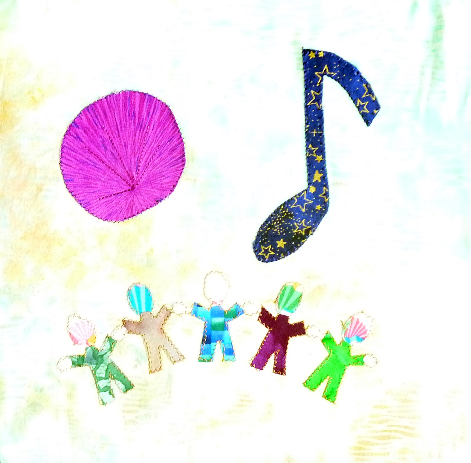
First a few made by kids in the church:


This is one of my favorites; it was made by one of the kids in the Godly Play class and all of these things are from one of their stories (the sheep, the gate-I think to heaven?  the lake and the stones).  Any Godly Play teachers out there know which story it is?


And here are some of the blocks made by adults:


Finally, one of my very favorites; I'm not sure who made this one but it really struck me.


I love the variety of blocks we had; representational, abstract, traditional Christian symbols, and other types of imagery.  Coming soon- pictures of the whole thing assembled!